A Computer Vision and Machine learning blog

My photo
I'm a Computer Vision and Machine learning developer.

Monday, October 24, 2016

Visualizations for regressing wheel steering angles in self driving cars with Keras

Here is all the code and a trained model
Eri Rubin also participated in this project.

enter image description here
This post is about understanding how a self driving deep learning network decides to steer the wheel.

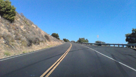
NVIDIA published a very interesting paper, that describes how a deep learning network can be trained to steer a wheel, given a 200x66 RGB image from the front of a car.
This repository shared a Tensorflow implementation of the network described in the paper, and (thankfully!) a dataset of image / steering angles collected from a human driving a car.
The dataset is quite small, and there are much larger datasets available like in the udacity challenge.
However it is great for quickly experimenting with these kind of networks, and visualizing when the network is overfitting is also interesting.
I ported the code to Keras, trained a (very over-fitting) network based on the NVIDIA paper, and made visualizations.

I think that if eventually this kind of a network will find use in a real world self driving car, being able to debug it and understand its output will be crucial.
Otherwise the first time the network decides to make a very wrong turn, critics will say that this is just a black box we don’t understand, and it should be replaced!


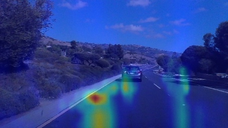
First attempt : Treating the network as a black box - occlusion maps

enter image description hereenter image description here

The first thing we will try, won’t require any knowledge about the network, and in fact we won’t peak inside the network, just look at the output.
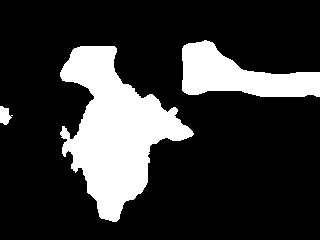
We”l create an occlusion map for a given image, where we take many windows in the image, mask them out, run the network, and see how the regressed angle changed.
If the angle changed a lot - that window contains information that was important for the network decision.
We then can assign each window a score based on how the angle changed!

We need to take many windows, with different sizes - since we don’t know in advance the sizes of important features in the image.

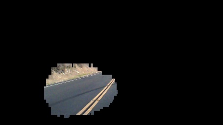
Now we can make nice effects like filtering the occlusion map, and displaying the focused area on top of a blurred image:
enter image description here

Some problems with this -
Its expensive to create the visualization since we need many sliding windows,
and it is possible that just masking out the windows created artificial features like sharp angles that were used by the network.
Also - this tells us which areas were important for the network, but it doesn’t give us any insight on why.
Can we do better?


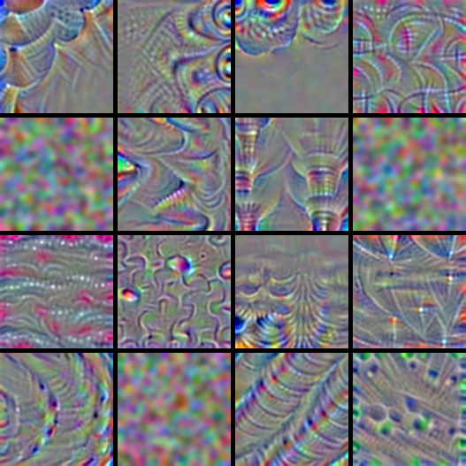
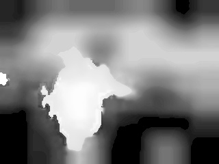
Second attempt - peaking at the conv layers output features with hypercolumns

enter image description here
So we want to understand what kind of features the network saw in the image, and how it used them for its final decision.
Lets use a heuristic - take the outputs of the convolutional layers, resize them to the input image size, and aggregate them.
The collection of these outputs are called hypercolumns, and here is a good blog post about getting them with Keras.
One way of aggregating them is by just multiplying them - so pixels that had high activation in all layers will get a high score.
We will take the average output image from each layer, normalize it, and multiply these values from wanted layers.
In the NVIDIA model, the output from the last convolutional layer is a 18x1 image.
If we peak only at that layer, we basically get a importance map for columns of the image:
enter image description here

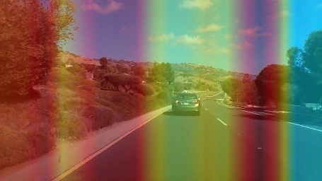
Anyway, this is quite naive and completely ignores the fully connected layers, and the fact that in certain situations some outputs are much more important than other outputs, but its a heuristic.

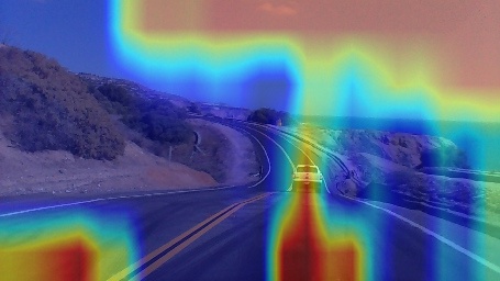
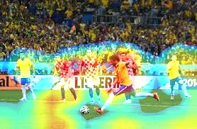
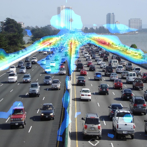
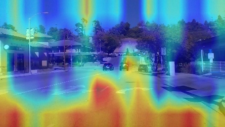
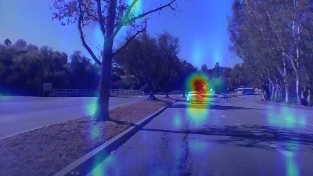
Here is a video with visualuzations done by both occlusion mapping and hypercolumns:

Third attempt - Getting there - class activation maps using gradients

enter image description here
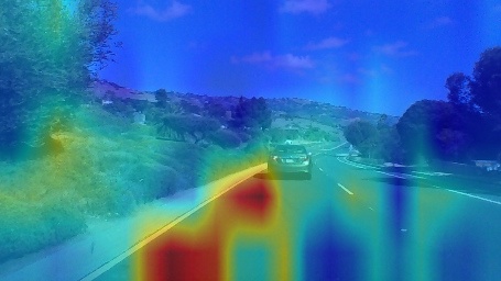
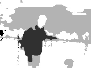
(The above image shows pixels that contribute to steering right)

Class activation maps are a technique to visualize the importance of image pixels to the final output of the network.
Basically you take the output of the last convolutional layer, you take a spatial average of that (global average pooling), and you feed that into a softmax for classification.
Now you can look at the softmax weights used to give a category score - large weights mean important features - and multiply them by the corresponding conv outputs.

Relative to the rest of the stuff we tried here - this technique is great. It gives us an insight of how exactly each pixel was used in the overall decision process.
However this technique requires a specific network architecture - conv layers + GAP, so existing networks with fully connected layers, like the nvidia model, can’t be used as is.
We could just train a new model with conv layers + GAP (I actually did that), however we really want the fully connected layers here. They enable the network to reason spatially about the image - If it finds interesting features in the left part of the image - perhaps that road is blocked?

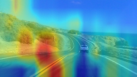
This paper solves the issue, and generalizes class activation maps.
To get the importance of images in the conv outputs, you use back propagation - you take the gradient of the target output with respect to the pixels in conv output images.
Conv output images that are important for the final classification decision, will contain a lot of positive gradients. So to assign them an importance value - we can just take a spatial average of the gradients in each conv output image (global average pooling again).

I wrote some Keras code to try this out for classification networks.

So lets adapt this for the steering angle regression.
We can’t just always take gradient of the output, since now when the gradient is high, it isn’t contributing to a certain category like in the classification case, but instead to a positive steering angle. And maybe the actual steering angle was negative.

Lets look at the gradient of the regressed angle with respect to some pixel in some output image -
If the gradient is very positive, that means that the pixel contributes to enlarging the steering angle - steering right.
If the gradient is very negative, the pixel contributes to steering left.
If the gradient is very small, the pixel contributes to not steering at all.

We can divide the angles into ranges - if the actual output angle was large, we can peak at the image features that contributed to a positive steering angle, etc.
If the angle is small, we will just take the inverse of the steering angle as our target - since then pixels that contribute to small angles will get large gradients.

def grad_cam_loss(x, angle):
    if angle > 5.0 * scipy.pi / 180.0:
        return x
    elif angle < -5.0 * scipy.pi / 180.0:
        return -x
    else:
        return tf.inv(x) * np.sign(angle)

Lets look at an example.
For the same image, we could target pixels that contribute to steering right:
enter image description here
And we could also target pixels that contribute to steering to the center:
enter image description here

enter image description here

Friday, August 19, 2016

Class activation maps in Keras

Class activation maps in Keras for visualizing where deep learning networks pay attention

Github project with all the code

Class activation maps are a simple technique to get the discriminative image regions used by a CNN to identify a specific class in the image.
In other words, a class activation map (CAM) lets us see which regions in the image were relevant to this class.
The authors of the paper show that this also allows re-using classifiers for getting good localization results, even when training without bounding box coordinates data.
This also shows how deep learning networks already have some kind of a built in attention mechanism.

This should be useful for debugging the decision process in classification networks.

To be able to create a CAM, the network architecture is restricted to have a global average pooling layer after the final convolutional layer, and then a linear (dense) layer.
Unfortunately this means we can’t apply this technique on existing networks that don’t have this structure. What we can do is modify existing networks and fine tune them to get this.
Designing network architectures to support tricks like CAM is like writing code in a way that makes it easier to debug.

The first building block for this is a layer called global average pooling.
After the last convolutional layer in a typical network like VGG16, we have an N-dimensional image, where N is the number of filters in this layer.
For example in VGG16, the last convolutional layer has 512 filters.
For an 1024x1024 input image (lets discard the fully connected layers, so we can use any input image size we want), the output shape of the last convolutional layer will be 512x64x64. Since 1024/64 = 16, we have a 16x16 spatial mapping resolution.
A global average pooling (GAP) layer just takes each of these 512 channels, and returns their spatial average.
Channels with high activations, will have high signals.
Lets look at keras code for this:

def global_average_pooling(x):
    return K.mean(x, axis = (2, 3))

def global_average_pooling_shape(input_shape):
    return input_shape[0:2]

The output shape of the convolutional layer will be [batch_size, number of filters, width, height].
So we can take the average in the width/height axes (2, 3).
We also need to specify the output shape from the layer, so Keras can do shape inference for the next layers. Since we are creating a custom layer here, Keras doesn’t really have a way to just deduce the output size by itself.

The second building block is to assign a weight to each output from the global average pooling layer, for each of the categories.
This can be done by adding a dense linear layer + softmax, training an SVM on the GAP output, or applying any other linear classifier on top of the GAP.
These weights set the importance of each of the convolutional layer outputs.

Lets combine these building blocks in Keras code:

def get_model():
    model = VGG16_convolutions()
    model = load_model_weights(model, "vgg16_weights.h5")

    model.add(Lambda(global_average_pooling, 
              output_shape=global_average_pooling_shape))
    model.add(Dense(2, activation = 'softmax', init='uniform'))
    sgd = SGD(lr=0.01, decay=1e-6, momentum=0.5, nesterov=True)
    model.compile(loss = 'categorical_crossentropy', optimizer = sgd, metrics=['accuracy'])
    return model

Now to create a heatmap for a class we can just take output images from the last convolutional layer, multiply them by their assigned weights (different weights for each class), and sum.

def visualize_class_activation_map(model_path, img_path, output_path):
    model = load_model(model_path)
    original_img = cv2.imread(img_path, 1)
    width, height, _ = original_img.shape

    #Reshape to the network input shape (3, w, h).
    img = np.array([np.transpose(np.float32(original_img), (2, 0, 1))])

    #Get the 512 input weights to the softmax.
    class_weights = model.layers[-1].get_weights()[0]
    final_conv_layer = get_output_layer(model, "conv5_3")
    get_output = K.function([model.layers[0].input], [final_conv_layer.output, 
    model.layers[-1].output])
    [conv_outputs, predictions] = get_output([img])
    conv_outputs = conv_outputs[0, :, :, :]

    #Create the class activation map.
    cam = np.zeros(dtype = np.float32, shape = conv_outputs.shape[1:3])
    class = 1
    for i, w in enumerate(class_weights[:, class]):
            cam += w * conv_outputs[i, :, :]

To test this out I trained a poor man’s person/not person classifier on person images from here:
http://pascal.inrialpes.fr/data/human
In the training all the images are resized to 68x128, and 20% of the images are used for validation.
After 11 epochs the model over-fits the training set with almost 100% accuracy, and gets about 95% accuracy on the validation set.

To speed up the training, I froze the weights of the VGG16 network (in Keras this is as simple as model.trainable=False), and trained only the weights applied on the GAP layer.
Since we discarded all the layers after the last convolutional layer in VGG16, we can load a much smaller model:
https://github.com/awentzonline/keras-vgg-buddy

Here are some more examples, using the weights for the “person” category:

In this image it’s disappointing that the person classifier made a correct decision without even using the face regions at all.
Perhaps it should be trained on more images with clear faces.
Class activation maps look useful for understanding issues like this.
enter image description here

enter image description here

Here’s an example with weights from the “not person” category.
It looks like it’s using large “line-like” regions for making a “not person” decision.
enter image description here

Saturday, March 26, 2016

Visualizing CNN filters with Keras

Here is a utility I made for visualizing filters with Keras, using a few regularizations for more natural outputs.
You can use it to visualize filters, and inspect the filters as they are computed.

By default the utility uses the VGG16 model, but you can change that to something else.
The entire VGG16 model weights about 500mb.
However we don’t need to load the entire model if we only want to explore the the convolution filters and ignore the final fully connected layers.
You can download a much smaller model containing only the convolution layers (~50mb) from here:
https://github.com/awentzonline/keras-vgg-buddy

There is a lot of work being done about visualizing what deep learning networks learned.
This in part is due to criticism saying that it’s hard to understand what these black box networks learned, but this is also very useful to debug them.
Many techniques propagating gradients back to the input image became popular lately, like Google’s deep dream, or even the neural artistic style algorithm.
I found the Stanford cs231n course section to be good starting point for all this:
http://cs231n.github.io/understanding-cnn/

This awesome Keras blog post is a very good start for visualizing filters with Keras:
http://blog.keras.io/how-convolutional-neural-networks-see-the-world.html
The idea is quite simple: we want to find an input image that would produce the largest output from one of convolution filters in one of the layers.
To do that, we can perform back propagation from the output of the filter we’re interested in, back to an input image. That gives us the gradient of the output of the filter with respect to the input image pixels.
We can use that to perform gradient ascent, searching for the image pixels that maximize the output of the filter.
The output of the filter is an image. We need to define a scalar score function for computing the gradient of it with respect to the image.
One easy way of doing that, is just taking the average output of that filter.

If you look at the filters there, some look kind of noisy.
This project suggested using a combination of a few different regularizations for producing more nice looking visualizations, and I wanted to try those out.

No regularization

Lets first look at the visualization produced with gradient ascent for a few filters from the conv5_1 layer, without any regularizations:
4x4 with no regularization
Some of the filters did not converge at all, and some have interesting patterns but are a bit noisy.

L2 decay

The first simple regularization they used in “Understanding Neural Networks Through Deep Visualization” is L2 decay.
The calculated image pixels are just multiplied by a constant < 1. This penalizes large values.
Here are the same filters again, using only L2 decay, multiplying the image pixels by 0.8:
4x4 L2 decay regularization
Notice how some of the filters contain more information, and a few of filters that previously did not converge now do.

Gaussian Blur

The next regularization just smooths the image with a gaussian blur.
In the paper above they apply it only once every few gradient ascent iterations, but here we apply it every iterations.
Here are the same filters, now using only gaussian blur with a 3x3 kernel:
4x4 gaussian blur
Notice how the structures become thicker, while the rest becomes smoother.

Removing pixels with small norms

This regularization zeros pixels that had weak gradient norms.
For each RGB channels the percentile of the average gradient value is
Even where a pattern doesn’t appear in the filters, pixels will have noisy non zero values.
By clipping weak gradients we can have more sparse outputs.

Here are 256 filters with the Gaussian blur and L2 decay regularizations, and a small weight for the small norm regularization:
16x16

Sunday, April 26, 2015

Smoothing images with the Mumford Shah functional

Try out my python implementation for minimizing the Mumford Shah functional.
import cv2
from AmbrosioTortorelliMinimizer import *

img = cv2.imread("image.jpg", 0)
solver = AmbrosioTortorelliMinimizer(img)
img, edges = solver.minimize()
enter image description hereenter image description here
Result of minimizing the Ambrosio-Tortorelli functionalResult of minimizing the Ambrosio-Tortorelli functional
The Mumford Shah functional, one of the most cited models in Computer Vision,
is designed to smooth homogeneous regions in an image, while enhancing edges.
You can minimize it to get edge preserving smoothing, or a segmentation of the image, depending on the parameters you choose.
enter image description here
The functional tries to enforce some conditions on the target image J:
1. The target image J should be similar to the input image I.
2. The target image J should be smooth, except at a set of edges B.
3. There should be few edges.
That’s a hard optimization problem.
Luckily, Ambrosio and Tortorelli showed that the functional can be represented in terms of another functional, where the edge set B is modeled by multiplication with a continuous function that represents the edges, and converges to the original mumford-shah functional when ɛ approaches 0.
enter image description here
z is ~0 for edges, and ~1 for smooth pixels.
The optimization problem is now to minimize:
enter image description here
Using functional calculus you can take derivatives of that, and obtain a linear system of equations for solving:
1. The edge set Z.
2. The image J.
Both depend on one another, so usually an alternation scheme is used:
Solve for the edge set Z while fixing J, and then solve for J while fixing Z.
To derive the equations I followed http://www.eng.tau.ac.il/~nk/TRs/LeahTIP2006.pdf
That paper also shows you can use the same functional as a regularizer for reconstructing sharp images out of blurred ones if you have the blurring kernel, or if you parameterize the kernel as a Gaussian.

There are a few practical problems with all this, though.
  1. Solving such a huge set of equations (one equation for every pixel) is slow.
    I provided the conjugate gradient solver a linear operator, instead of creating and storing a huge matrix.
    I wonder if using a pre-conditioner would do any good for speed of convergence.
    Also there should probably be a unified calculation for RGB images, instead of smoothing each channel.
  2. You have to choose a good value of ɛ.
In my implementation for the purpose of speed I set the default parameters to be few iterations and a high numerical tolerance. Results look good for even one AM iteration.
It’s pretty straight forward to implement on a GPU, since single pixel calculations are independent of one another.
On my machine the unconcurrent python implementation run time for 640x480 color images was about 0.6 seconds, so I guess a GPU implementation would speed it up a lot.
There is lots of ongoing work on phrasing other minimization problems to solve the same thing, and it’s getting close to real time.
In this paper (github repo) they phrased a similar functional, that’s independent of ɛ or the edge set (they model the edge set in terms of the image gradient), and boast 20 fps performance for color images.
They did use a GPU implementation, and a strong GPU to achieve that,
so I wonder what would be the performance of a GPU implementation for the Ambrosio-Tortorelli minimization.

Friday, April 24, 2015

Simple Image saliency detection from histogram backprojection

Image saliency detection is about identifying the interesting parts of an image, the parts of the image human eyes would fix on.
enter image description here enter image description here
Saliency detection is used in a lot of applications, the most popular of them is probably automatic thumbnail generation, where a descriptive thumbnail has to be generated for an image.
Usually a saliency map is generated, where a pixel is bright if it’s salient, and dark otherwise.
There are lots of interesting papers on this. Check out a great overview on saliency detection.
Anyway, in this post I’l share a simple heuristic for saliency detection.
The basic idea is that usually salient pixels should have very different colors than most of the other pixels in the image.
We measure each pixel’s similarity to the background by histogram back-projection.
Finally, we refine the saliency map with Grabcut.
So here we go.
Original image (taken at Mount. Takao, Japan)
enter image description here

1. Preprocessing: Filter the image with Mean Shift for an initial soft segmentation of the image.

This groups together close pixels that are similar, and generates a very smooth version of the image.
enter image description here
Some of the saliency papers call an inital segmentation stage - “abstraction”.
It’s common that each segment is compared somehow to other segments to give it a saliency score.
We won’t do that here, though.
For speed we use the multiscale pyramidal meanshift version in OpenCV.
This stage isn’t entirely necessary, but improves results on some images.
cv2.pyrMeanShiftFiltering(img, 2, 10, img, 4)

2. Back-project the Hue, Saturation histogram of the entire image, on the image itself.

The back-projection for each channel pixel is just the intensity, divided by how many pixels have that intensity.
It’s an attempt to assign each pixel a probability of belonging to the background.
We use only 2 bins for each channel.
That means we quantize the image into 4 colors (since we have 2 channels).
The more levels we use, the more details we get in the saliency map.
enter image description here
Notice how the blue jacket gets low values, since it’s unique and different from the background.
Also notice how the face back-projection is not unique.
That’s bad, we will try to fix that later.
def backproject(source, target, levels = 2, scale = 1):
    hsv = cv2.cvtColor(source,  cv2.COLOR_BGR2HSV)
    hsvt = cv2.cvtColor(target, cv2.COLOR_BGR2HSV)
    # calculating object histogram
    roihist = cv2.calcHist([hsv],[0, 1], None, [levels, levels], [0, 180, 0, 256] )

    # normalize histogram and apply backprojection
    cv2.normalize(roihist,roihist,0,255,cv2.NORM_MINMAX)
    dst = cv2.calcBackProject([hsvt],[0,1],roihist,[0,180,0,256], scale)
    return dst
backproj = np.uint8(backproject(img, img, levels = 2))

3. Process the back-projection to get a saliency map.

So here we smooth the back-projection image with mean shift, enhance the contrast of the saliency map with histogram equalization, and invert the image.
The goal is to produce a smooth saliency map where salient regions have bright pixels.
enter image description here
cv2.normalize(backproj,backproj,0,255,cv2.NORM_MINMAX)

saliencies = [backproj, backproj, backproj]
saliency = cv2.merge(saliencies)
cv2.pyrMeanShiftFiltering(saliency, 20, 200, saliency, 2)
saliency = cv2.cvtColor(saliency, cv2.COLOR_BGR2GRAY)
cv2.equalizeHist(saliency, saliency)

4. Threshold.

enter image description here
Ok, we have a few issues here:
- The segmentation is pretty rough.
- My head isn’t attached to the salient region.
(T, saliency) = cv2.threshold(saliency, 200, 255, cv2.THRESH_BINARY)

5. Find the bounding box of the connected component with the largest area.

We now have two salient regions.
A heuristic we use here is that the salient object will probably be the largest one.
We could’ve similarly assumed that the salient object will usually be closest to the center.
Saliency papers call that “encoding a prior”, since we use prior knowledge about how salient objects look.
def largest_contour_rect(saliency):
    contours, hierarchy = cv2.findContours(saliency * 1,
    cv2.RETR_LIST,cv2.CHAIN_APPROX_SIMPLE)

    contours = sorted(contours, key = cv2.contourArea)
    return cv2.boundingRect(contours[-1])

6. Refine the salient region with Grabcut.

We use the bounding box as an initial foreground estimation, and apply Grabcut.
This makes the salient region segmentation much more accurate,
and most importantly, attaches back my head.
enter image description hereenter image description hereenter image description here
def refine_saliency_with_grabcut(img, saliency):
    rect = largest_contours_rect(saliency)
    bgdmodel = np.zeros((1, 65),np.float64)
    fgdmodel = np.zeros((1, 65),np.float64)
    saliency[np.where(saliency > 0)] = cv2.GC_FGD
    mask = saliency
    cv2.grabCut(img, mask, rect, bgdmodel, fgdmodel, 1, cv2.GC_INIT_WITH_RECT)
    mask = np.where((mask==2)|(mask==0),0,1).astype('uint8')
    return mask
Link to the code on github.
I like this method since it’s simple, but it has it’s drawbacks.
enter image description hereenter image description here

Friday, December 5, 2014

Image Fisher Vector In Python

Although the state of the art in image classification is deep learning,
Bag of words approaches still perform well on many image datasets.

Fisher vectors is the state of the art in that approach, allowing training more discriminative classifiers with a lower vocabulary size.

I wrote a simple Python implementation for calculating fisher vectors and using it to classify image categories:

You might want to look here for a derivation: 

The main improvement here is extracting a richer feature vector from images compared to bag of words.

In Bag of Words, for each local feature we find the closest word in the vocabulary, and add +1 to the histogram of the vocabulary in the input image.
But we could have sampled more data: 
- How far is each feature from its closest vocabulary word.
- How far is the feature from other vocabulary words.
- The distribution of the vocabulary words themselves. 

Brief outline of fisher vectors

Vocabulary learning with GMM:
- Sample many features from input images.
- Fit a Gaussian Mixture Model on those features. 
- The result is a vocabulary of dominant features in the image, and their distributions.

Image representation based on the vocabulary:
- Measure the expectation of the difference and distance of the image features, from each Gaussian distrubution, using the likelihood a feature belongs to certain gaussian. 
- Concatenate the resulting vector for each vocabulary word, into one large descriptor vector.

There is also a normalization step that I will skip here but is a part of the implementation, that is important if the features are fed into a classifier like SVM that needs normalized inputs.

This is a generalization of bag of words. If you set the likelihood of a feature to a vocabulary word to be 1 to it's closest word and 0 to the rest, 
and if you redefine the distance to be a constant "1", you get the original bag of words model.

Trying out the implementation:
python fisher.py <path_to_image_directory> <vocabulary size>
The image directory should contain two sub folders, one for the images of each class.

It currently just trains a model and then classifies the images.
The input images definitely need to be partitioned into training and validation parts.

One more thing:
Fisher vectors are successfully used in image recognition, check out:
http://www.robots.ox.ac.uk/~vgg/publications/2013/Simonyan13/extras/simonyan13_ext.pdf
In their paper they extract features densely from a grid,  reduce the dimensionality with PCA, and augment the features with their spacial location.

Monday, May 5, 2014

Bag Of Visual Words model for image classification

I wanted to play around with Bag Of Words for visual classification, so I coded a Matlab implementation that uses VLFEAT for the features and clustering.
It was tested on classifying Mac/Windows desktop screenshots.


For a small testing data set (about 50 images for each category), the best vocabulary size was about 80.
It scored 97% accuracy on the training set, and 85% accuracy on the cross validation set,
so the over-fitting can be improved a bit more.

Overview:

1. Collect a data set of examples. I used a python script to download images from Google.
2. Partition the data set into a training set, and a cross validation set (80% - 20%).
3. Find key points in each image, using SIFT.
4. Take a patch around each key point, and calculate it's Histogram of Oriented Gradients (HoG). Gather all these features.
5. Build a visual vocabulary by finding representatives of the gathered features (quantization).
This done by k-means clustering.
6. Find the distribution of the vocabulary in each image in the training set.
This is done by a histogram with a bin for each vocabulary word.
The histogram values can be either hard values, or soft values.
Hard values means that for each descriptor of a key point patch in an image, we add 1 to the bin of the vocabulary word closest to it in absolute square value.
Soft values means that each patch votes to all histogram bins, but give a higher weight to bin representing words that are similar to that patch. Take a look here.
7. Train an SVM on the resulting histograms (each histogram is a feature vector, with a label).
8. Test the classifier on the cross validation set.
9. If results are not satisfactory, repeat 5 for a different vocabulary size and a different SVM parameters.

Visualization of the vocabulary learned by the clustering


Source Code

https://github.com/jacobgil/BagOfVisualWords